Skip to content

Your Guide to Choosing the Correct Font Size for Signs & Banners

Avatar photo
Author: Glen Fairbanks | President
Your Guide to Choosing the Correct Font Size for Signs & Banners

Signs can attract potential customers to your business and create brand awareness in your community. The creative use of color, light and design can trigger a consumer’s purchase impulse, increase sales and revenue and encourage visitors to support local businesses. Colorful signs can convey important announcements or promote local events or speakers. They can also increase customer traffic by highlighting specific products or announcing sales and discounts. In short, signs inform, engage and can improve a consumer’s experience.

It’s important to note that signs can direct potential customers to your website just by adding a website URL, social media handle or QR code.

But when it comes to the sign’s design, the letter sizing is critical. After all, your potential viewers need to be able to read your message.

A group of people collaborating around a table

How big should sign and banner letters be?

Letter height is one of the most important features to consider when designing a sign. A catchy slogan, a fun or beautiful logo, bold color choices, a perfect business name — your sign may have it all, but none of it will matter if customers can’t read your message.

Letter sizing is often an overlooked aspect of creating custom signs, banners or billboards, but there’s an easy formula for determining font size: at least one inch tall for every 10 feet of viewing distance.

If your sign needs to reach customers 20 feet away from your door, your most important words need to be at least two inches tall. If you’re trying to reach viewers in approaching cars from 200 feet away, your letters need to be 20 inches tall.

With that in mind, it’s important to think about the sizing of different words. But letter sizing isn’t everything; other design elements also affect the readability of your sign, including:

  • Font style: Typically, non-serif fonts with clear bold lines are great choices. Check out the professional signage in your industry for inspiration or dafont.com for more information.
  • Kerning: This refers to the spacing between letters, which can make or break how viewers take in your sign. It’s a good idea to engage a graphic design professional to help with this important detail.
  • White/negative space: Clutter can obscure your message, no matter how big the size lettering. We suggest that all of your sign and banner content combined take up about 40% of the available space.
  • Colors: Consider bold colors, which are more eye-catching, and save neutrals for your negative space. High contrast between content and negative space helps your message stand out.

Common letter height recommendations

While it’s important for your signage to stand out, there are some typical letter height range recommendations that apply to certain sign categories. When you start designing your sign or banner, and depending on how much text you have, these size ranges are a great jumping off point:

  • Yard and political signs: 5”-7”
  • Roadside and sidewalk signs: 6”-12”
  • Window and storefront sign lettering: 8”-12”
  • Traffic and outdoor way finding signs: 10”-14”
  • Retail advertising and special event banners: 12”-24”

Business names: 24”-48”

Common font size to inches conversions

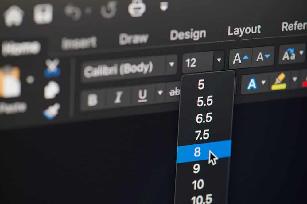
Font choice can affect size conversions; however, below is a good starting point to easily translate your letter heights to font points in design or word processing software with a few common conversions.

  • For lettering 1.5” tall, your font size should be 150 pt.
  • For lettering 2” tall, your font size should be 200 pt.
  • For lettering 5” tall, your font size should be 360 pt.

As long as there have been businesses, there have been signs. They’ve been used for centuries to promote shops, eateries, events and services. From simple wooden signs to interstate LED billboards, brands have relied on the visibility and recognition afforded by the right signage.

So, are you ready to take your signs and banners to the next level? DGI and the Invisuals team are ready to create the ideal signage for your business. Have questions? Need a consultation? We’d love to help!

Contact us today to get started.
Author:
Avatar photo
Glen Fairbanks | President

Glen joined DGI in 1994, just as the large format digital printing industry was emerging. He was originally hired as a telemarketer, quickly rose to inside sales, then managed the customer service department. From there, Glen moved to outside sales, becoming a top performer and exceeding goals by selling over a million dollars several years in a row.

Learn More
Education Signage: Preparing Your School for the "New Normal"
Grab my eBook
Footer CTA
Ready to start your project?
Request a Quote