Retail store layout, retail store design or retail layout design all refer to the way retailers place fixtures, create pathways and display products and merchandise. But in today’s world, where tech rules and attention spans are short, how can you make your store stand out and convert traffic into revenue?
There’s no perfect way to lay out your store. Your ideal retail store layout will depend on your space, target market and the products you sell. Let’s look at some retail store interior design ideas and trends.
Quick Navigation
Pay Attention to Customer FlowStart with Space
Be Strategic About Floor Plan Types & Store Layout
Common Retail Store Floor Plans
Create a “Decompression Zone”
Create Immersive Experiences
Appeal to the Senses
Be Strategic About Product Quantity
Highlight Your Brand
Create Comfort Zones
What Are the Next Steps?
Pay Attention to Customer Flow
The right retail store layout can steer shoppers the right way. Shoppers typically look left, then head right and travel counterclockwise around the store. Encourage this natural inclination by creating a colorful, inviting feature such as seasonal or limited-access merchandise near the entry to create a brief pause, followed by an enticing path to the right.
Make sure to leave enough room between products and fixtures. Keep aisles and areas between displays spacious to avoid the dreaded “butt-brush.”
Be Strategic About Floor Plan Types & Store Layout
- Accessibility: According to the American Disabilities Act (ADA) guidelines, the minimum width of an aisle must be at least 32 inches and allow for a wheelchair to pass through comfortably. The ADA also has regulations around parking, ramps, counters and bathrooms to ensure accessibility for all.
- Checkout counter: Display impulse-purchase items — think candy, gum or chapstick — en route to the cashier to entice customers while waiting in line.
- Zone design and merchandise strategies: Think about how you want to sell your products, how customers usually buy and design your retail layout to draw customers through that ideal shopping experience. For example, many grocery stores place tomato sauce and pasta in the same aisle since they’re often purchased together.
- Product mapping: Study how shoppers behave in similar retail locations, consider what you sell and how your narrative will unfold as shoppers move through your space. When they encounter a product can, it can influence a buyer to choose something new or unexpected.
- Sketch out your floor plan on paper: A visual aid, such as a planogram, can show you potential flaws in your retail area design and give you a chance to edit before you bring in displays and inventory.
Common Retail Store Floor Plans
Grid
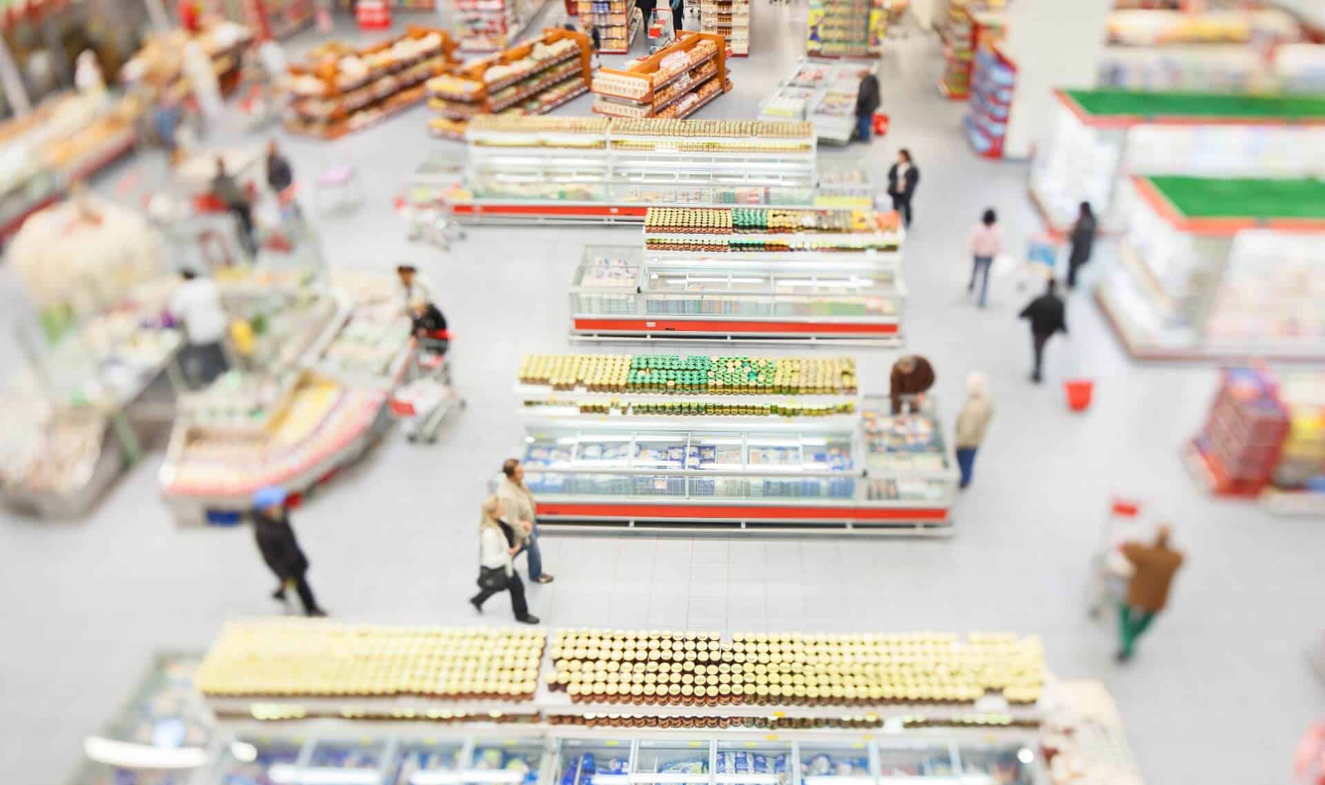
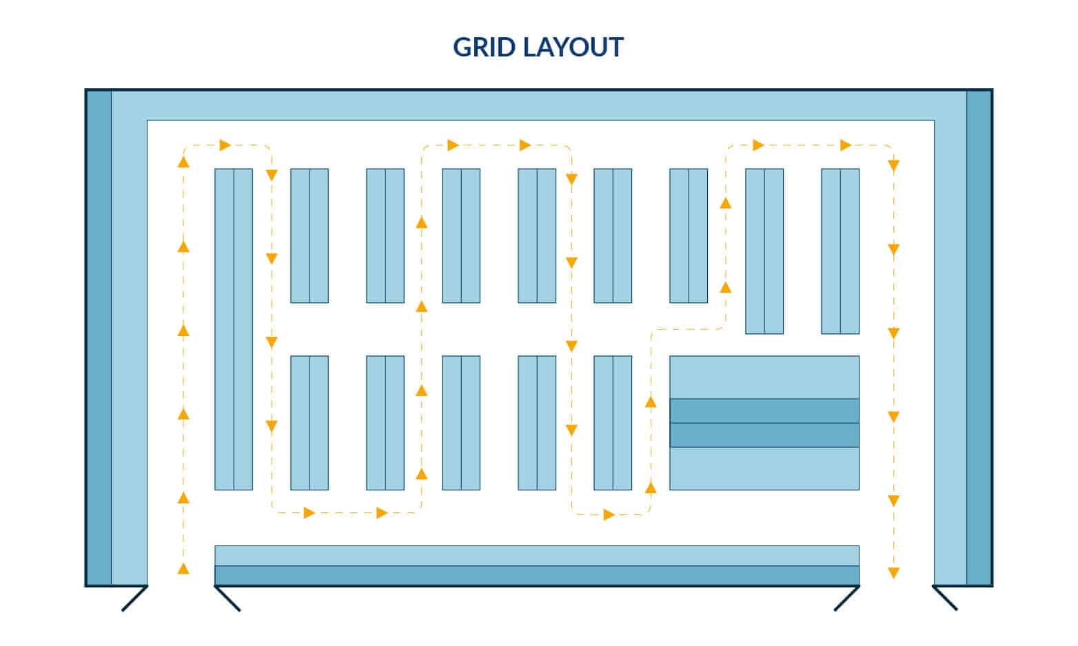
A grid layout displays products in long aisles for shoppers to browse as they travel through. This retail layout maximizes quantity and variety and minimizes white space. Most convenience stores, pharmacies and grocery stores use the grid layout. Ideally, 48-inch aisles allow for maximum flow and social distancing, which is a critical factor for current retailers.
| Pros of the Grid Layout | Cons of the Grid Layout |
|
|
Loop or Racetrack
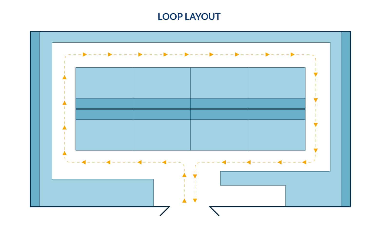
The loop or racetrack retail store layout creates a deliberate, controlled path, leading shoppers from the entrance, through merchandise and finally to the cashiers.
Forced Path
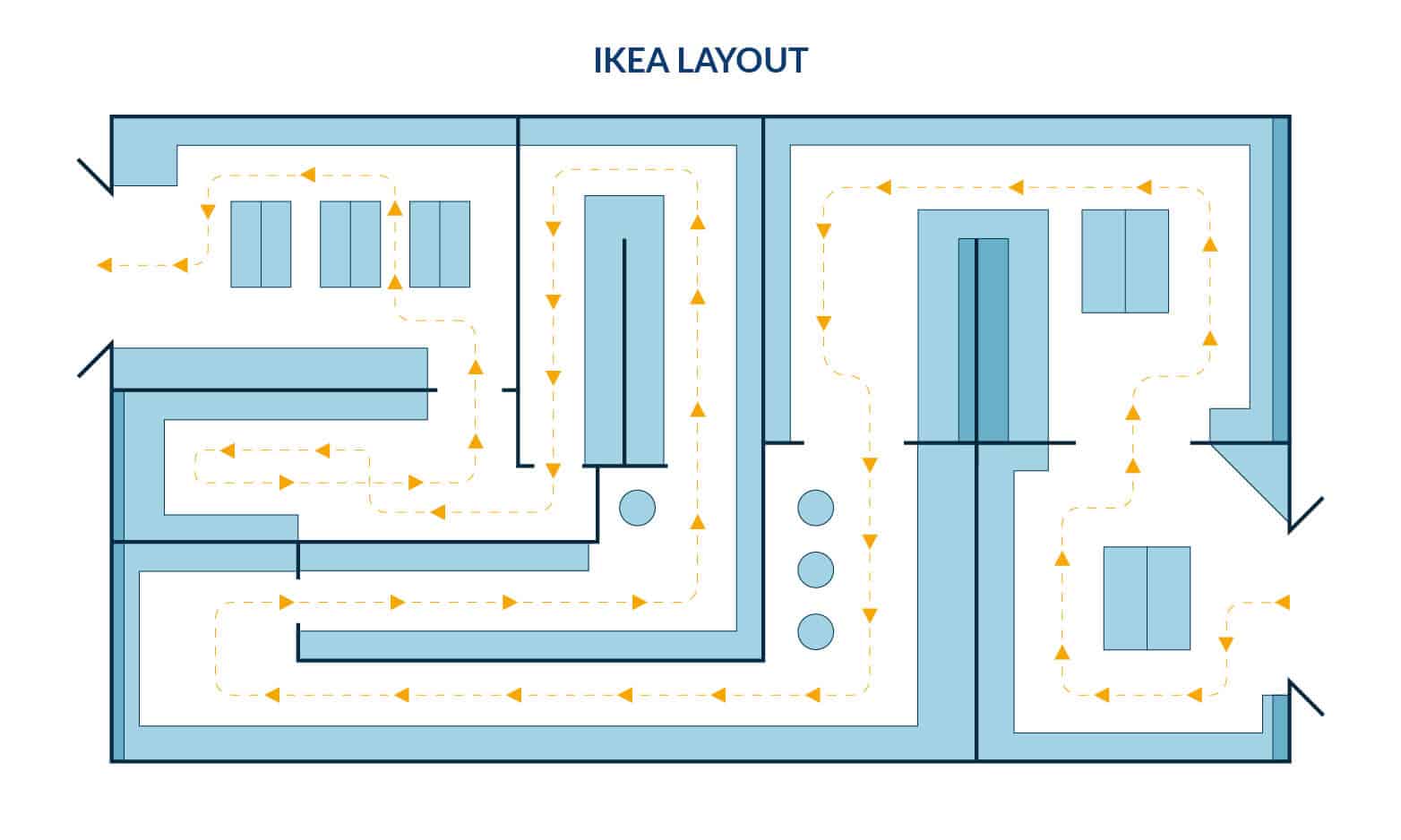
The forced-path layout is a loop or racetrack that is not only controlled, but closed to establish a storytelling experience. IKEA is a well-known example of a forced path retail layout design, taking shoppers on a journey through rooms of a home and business. Forced-path can spark imagination and creativity, but it takes the cons of the loop design a step further.
| Pros of the Loop/Racetrack Layout | Cons of the Loop/Racetrack Layout |
|
|
Free-flow
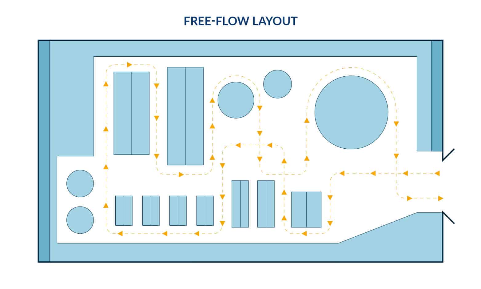
The free-flow layout encourages shoppers to linger and wander while browsing. How merchandise is organized is bound only by available space and imagination. That said, it’s easy to make mistakes with no clear rules in place. Best practices based on shopper preferences and behaviors should be considered to successfully deploy a free-flow layout.
Boutique
The boutique or shop-in-shop/alcove store layout is a specific type of free-flow retail layout design. Products are separated by brand or category and displayed in small, more intimate mini-shop areas laid out to complement and engage with one another as parts of the larger whole.
| Pros of the Free-Flow | Cons of the Free-Flow |
|
|
Straight or Spine
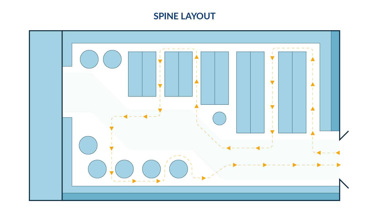
The straight store layout, also known as the spine layout, is simple to plan and gives space for shoppers to browse. A single main aisle draws shoppers to the back of the store, with opportunities to step into side aisles along the way. Strategically placed displays and signage keep shoppers engaged and moving along the main aisle. This retail layout design is optimal for both small markets and large department stores — large stores can use the spine to connect the different product sections.
| Pros of the Free-Flow | Cons of the Free-Flow |
|
|
Diagonal
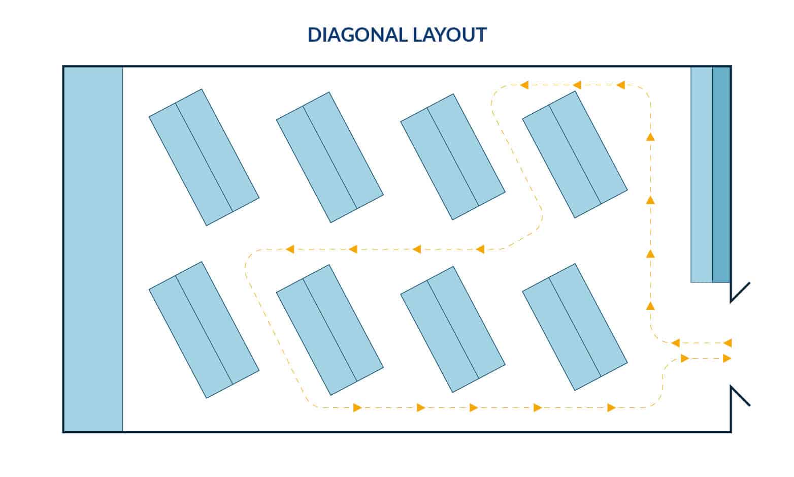
The diagonal retail design layout places aisles at an angle to the front and back of the door, exposing shoppers to the full range of products as they shop. It’s a variation of the grid layout and can help guide shoppers to the checkout counter. This retail layout design makes great use of limited spaces.
| Pros of the Diagonal Layout | Cons of the Diagonal Layout |
|
|
Angular
“Angular” is a bit of a misnomer here. This retail store design is named for the angled path shoppers are directed along as they peruse a free-flowing display design of rounded tables. This layout is best-suited to small shops with a luxury or boutique vibe, but don’t be deceived by the seemingly unstructured feel: The angular layout allows you to clearly define how you intend shoppers to travel through your store.
| Pros of the Angular | Cons of the Angular |
|
|
Geometric
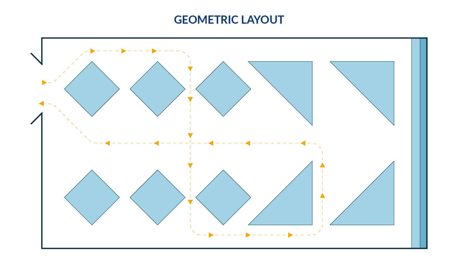
The geometric retail store layout combines creativity and practicality. With this retail design, geometric product displays and fixtures in a range of shapes and sizes are arranged to show merchandise to its best effect, often by “cross-pollinating” different thematically connected kinds of products.
| Pros of the Geometric | Cons of the Geometric |
|
|
The best part? You don’t have to choose just one!
Use elements from multiple common layouts to create a unique store design. Start with a layout that suits the basic size and shape of your space. Within your space, combine the different layouts to create the perfect shopper journey that complements your brand.
Create a “Decompression Zone”
The last thing you want is to overwhelm a customer the moment they walk into your store. Use the area just inside your entry to offer your shoppers a moment to get their bearings. Use colorful, welcoming displays with plenty of space to get their bearings. You can also add seating at the front of the store for customers who need a rest or a quick shopping break.
Create Immersive Experiences
There are many ways to create immersive experiences within the shopping experience. Here are just a few:
- Incorporate QR codes: Strategic placement of QR codes can direct shoppers to your website or app, coupons, social media links, or digital media that support your store’s narrative.
- Make displays photogenic to encourage social media: Nothing’s better than word-of-mouth marketing, which means selfies and influencer-style photos on platforms like Instagram. Making your displays accessible and attractive to potential buyers and potential brand ambassadors is a win-win.
- Create a prize wheel that customers can spin: Make or purchase a prize wheel that offers discounts or a small freebie for customers who spend over a certain amount at checkout.
Appeal to the Senses
Shoppers will be drawn to displays that engage their senses.
- Sight: Use signage intentionally. Create focal points in your merchandise displays that draw shoppers in by centering on a single color or complementing color palette. Utilize natural light sources if you can; mimic natural light if you can’t. Natural light puts people at ease and often shows products advantageously. LED video walls can engage your users at central points in your store with eye-catching images, sales messaging and up-to-date promotions.
- Smell: If your merchandise includes fragrances or scented items (think candles, cleaning products, flowers, and so on.), be mindful of how they are displayed. Too much fragrance can be a turn-off for shoppers, as can conflicting scents. Seasonal fragrances can inspire purchases. After all, it wouldn’t be autumn without pumpkin spice.
- Touch: Assuming it’s okay for shoppers to handle the merchandise, display your most invitingly textured products in a way that encourages touch. Soft sweaters, cozy plush blankets, and silky fabrics are incredibly tempting. Is your product polished and ergonomic? Let shoppers talk themselves into buying with a display that lets the product do the tactile talking.
- Taste: Have you ever been to a Costco when the free sample carts are open? Those carts tempt shoppers with smell and taste, prompting them to buy the featured item, even if it wasn’t on their grocery list. Sometimes just the presence of a sample will inspire confidence in the product.
- Hear: Match your music to your ideal shopper. Do they listen to Top 40 hits? Are they soothed by classical music? Are your ideal shoppers chasing the latest trending artists? What’s the mood in your store —classic and elegant? Playful? Edgy? Music can set the atmosphere almost instantly.
Is your store too loud when crowded? Acoustic paneling can help dampen the commotion with decorative flair and sound masking solutions can help create a better audible experience.
Be Strategic About Product Quantity
Consider your market demographic. Are you looking to appeal to a discerning, up-market shopper? Think about jewelry stores or high-end technology brands. They often use streamlined, uncluttered displays featuring one of each model or product. Luxury stores generally display fewer products to create a sense of worth. Big box stores, on the other hand, display a large inventory to show they stock a variety of products at a great value.
Highlight Your Brand
- Curbside appeal: Buyer loyalty begins before passersby come through the door. Entice shoppers with brand-specific signage and window displays.
- Change up displays regularly: Roll with the seasons, celebrate holidays and feature fresh merchandise with regular display re-designs that keep your brand fresh in the eyes of both loyal and potential shoppers.
- Cross-merchandise: This can be accomplished in more than one way. If you sell more than one type of item, display them in ways that use both, signaling to shoppers that every part of your store has value. Partner with other brands, in-store and beyond, to enhance both your images and attract new customers.
- Brand storytelling: Great retail store design tells a compelling story. Retail layout design should consider the target demographic and how best to bring the narrative to your ideal shopper.
- Flexible display options: Choose your physical display pieces wisely. Ideally, you want display pieces that are multi-purpose, neutral enough to re-use throughout the sales cycle, and suit your brand aesthetic.
Create Comfort Zones
Shopping can be fatiguing. Offer your shoppers comfortable places to rest, and they’ll stay in your store longer.
- Dressing room area: Think comfy seating, lots of hooks and space, lighting and color that flatters and art/advertising that reflects your brand’s style.
- Seating area: If your retail space design is large, or has dressing rooms, consider placing seating areas strategically near the dressing rooms, the cashiers and any other convenience areas in your store. If browsing and trying on is a pleasant experience for a shopper’s companion, they’ll be more inclined to buy. No one likes to be rushed or to make their companions uncomfortable.
- Customer service area: Visiting customer service can be stressful for shoppers. Take this opportunity to make them feel welcome by making your customer service area comfortable, well-lit and uncluttered with seating if it’s possible shoppers will have to wait their turn.
- Eating area: Bookstores and cafés, malls and food courts, big box stores and quick-service snack counters…some combinations just work.
What Are the Next Steps?
When choosing a retail layout design, take into account your merchandise, demographic, ideal consumer behavior and available square footage. If you’re in the market for a trusted partner to guide you from planning to a finished retail area design, DGI’s industry-leading design professionals are ready to help. Give us a call today.
