Beige shelves, drab linoleum floors, outdated signage — in the past, you could succeed in grocery retail without paying much attention to design. But not anymore. A convenient location, great product selection, helpful staff and low prices aren’t enough in today’s competitive landscape. Supermarkets needs to offer more to win over skeptical, time-strapped consumers. Your physical location needs to include branding, an appealing message and the right design cues to help drive repeat visits, keep a higher margin and increase customer satisfaction. Let’s take a look at what recent interior design trends and ideas can make a difference in your stores.
Help Fast & Slow Shoppers
Grocery stores need to design their stores with customers in mind. This means catering to both shoppers who come prepared with a grocery list and those who prefer to browse.
Slow shopping studies have shown that when consumers spend more time in-store they have a better experience and spend more. Indeed, studies find that “browsing in a store should be a leisurely and enriching experience.” Space can limit the opportunities to encourage slow shopping, but retailers with above average square footage should look for way to create enhanced experiences, open spaces and other slow shopping opportunities for their guests, inside and outside.
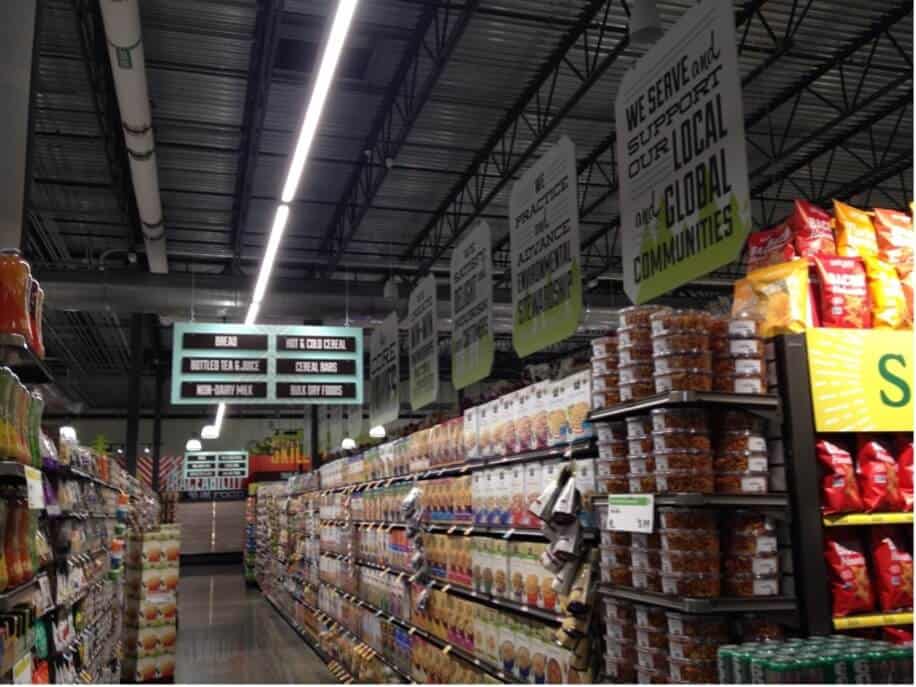
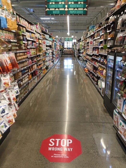
Not every shopper has the time to meander; what about the customer who needs that one specific ingredient, immediately? Fast shoppers need a layout that makes sense, caters to traditional grid-perimeter patterns and offers multi-channel wayfinding tools to get them in and out in a hurry. In addition, traditional printed displays — standalone or on carts — can help them find the right aisle and products and the check-out option that keeps them coming back.
Interior Design Elements
Most grocery brands have a well-established color palate that drives everything from the weekly sales circular to large format printed wall displays. Experts agree clean and modern design resonates strongly with consumers, using engaging color that doesn’t overwhelm.
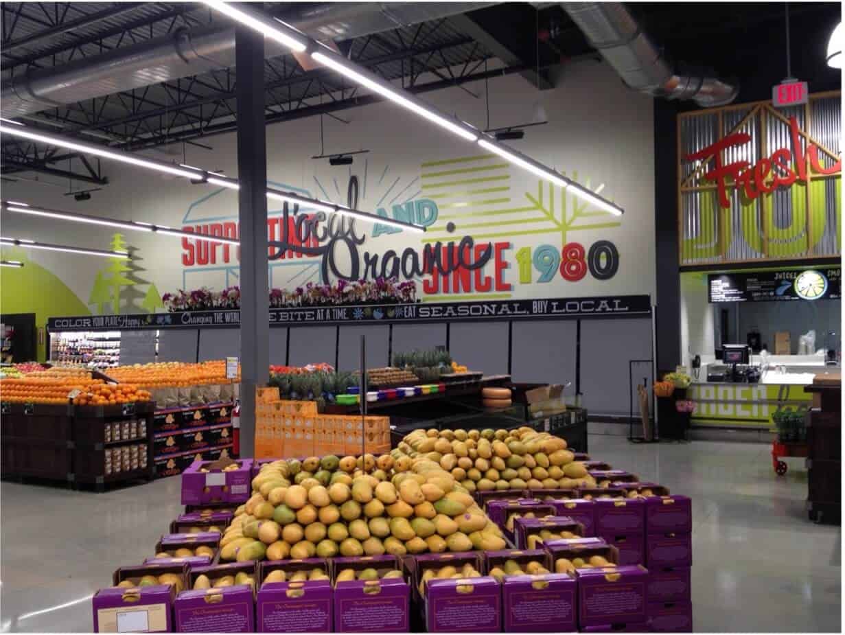
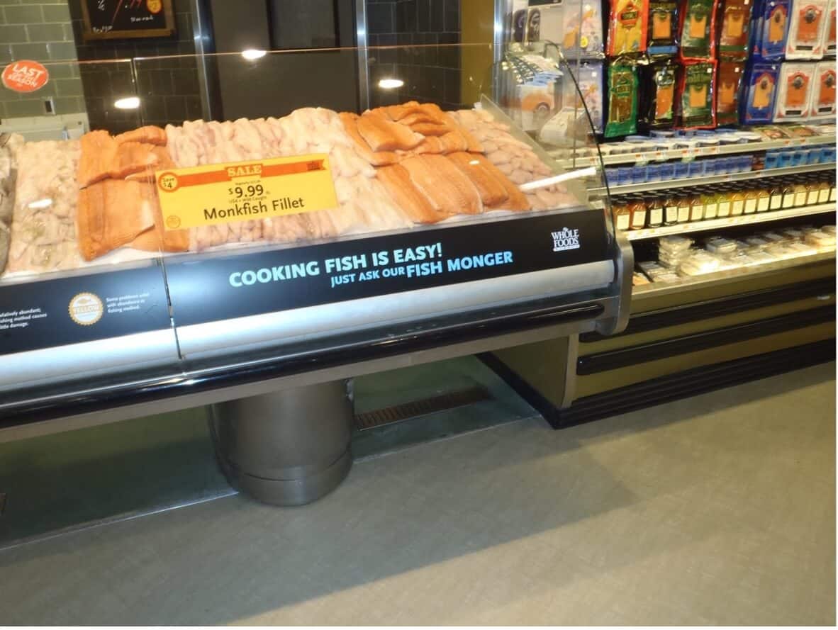
Your color palette speaks to your brand, your message, and your relationship with your customers. Don’t be afraid to display your branding in rich, vibrant colors and textures. Let your guests know you value them by giving them a fresh, upscale shopping environment with high quality installations like large format wall prints and fabric solutions.
Keep the Future in Mind
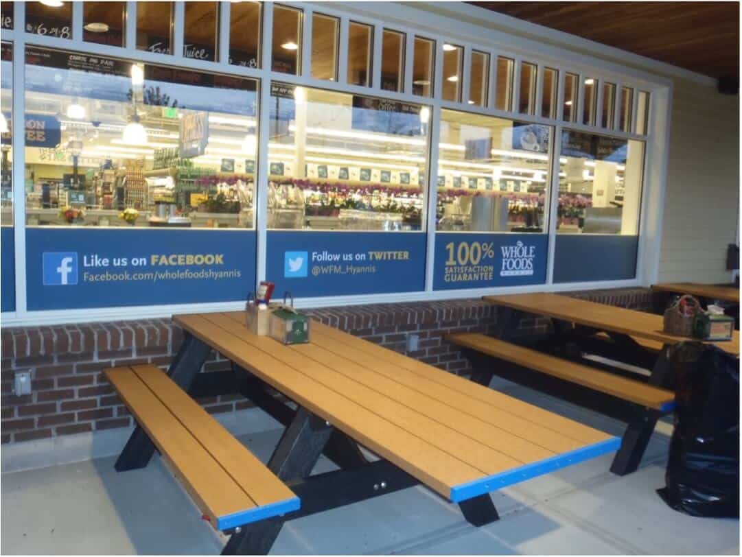
Customers want to feel confident that your store is clean and safe. They also want to understand specific store rules and expectations. Even as we enter 2023, many municipalities and retailers still require or suggest mask usage indoors. The right signage, displays and protective barriers send a message that your store cares about the health and safety of both team members and guests their stores.
With the expansion of curbside pickup and touchless shopping, many shoppers today don’t even set foot in the store. These innovations appeal to fast shoppers trying to maximize their time. Clearly marked, dedicated parking spots help, as do integrated technologies like apps and unique QR codes to alert team members of arriving customers.
Local, Sustainable & Fresh
Eye-catching discounts, rows of ripe produce, boxes stacked high on an endcap …
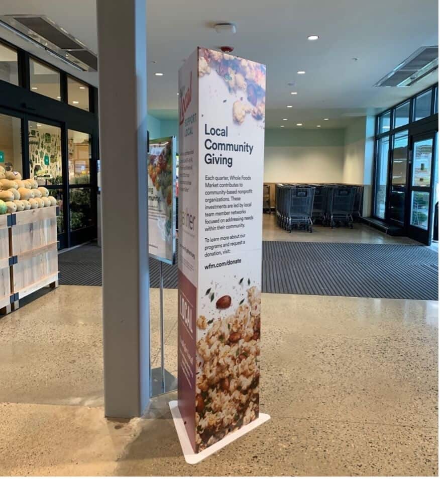
More stores use eye-catching discounts and fresh produce right at the front of the store, but customers want more. They want to know where and how their food is grown and produced. Rotating signage can indicate not only what items are organic or farmed locally but can also tell the story of the farmers themselves. Imagery can help localize a store, particularly when it’s located in an urban setting. Designs that convey a unique shopping experience and products that align with a customer’s preferences and values drives results. Digital signage, like an LED video wall, can be a centerpiece to drive this message home.
Embrace Technology
Many stores have fewer staff than ever (or no-staffing, in the case of Amazon Go locations), which makes it harder for your customers to get help if they need it. Digital wayfinding solutions, via app, kiosk and digital display can offer an eye-catching way to get focused shoppers to their destination quickly. Self-checkouts can help shoppers skip long checkout lines.
Create Open/Leisure Spaces
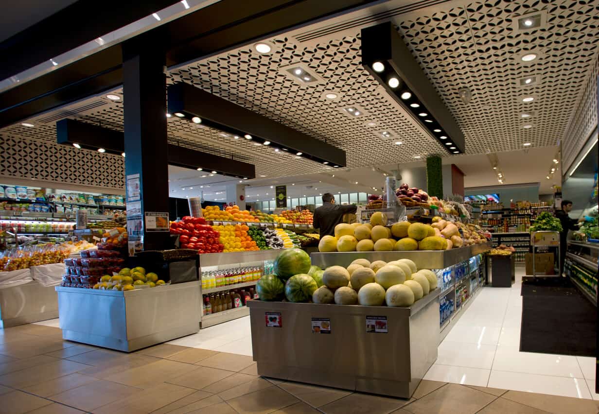
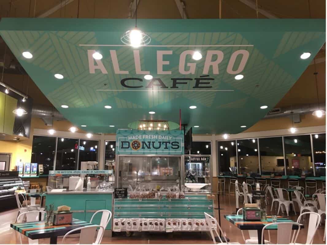
While supermarkets have historically operated in a predictable grid traffic flow, many grocers are adding a more free-flow perimeter with ancillary services like coffee bars, fine cheese and wine displays — even sushi bars — and other high-margin merchandise to encourage a more relaxed and luxurious shopping experience. Each of these areas should have design elements distinct from the main retail floor: The coffee bar should look like a café; the wine area like a high-end wine merchant; and the health and beauty section like the waiting room of a spa.
Supermarket / Grocery Store Designs
Implementing these design enhancements doesn’t have to disrupt your stores. You need a partner who gets the design elements right the first time, helps install on schedule and can cover your location(s) throughout the U.S. DGI has helped retailers and supermarkets all over the country. Recently we helped deliver 11,000 floor decals for Whole Foods Market in record time.
Want to find out how some of these design elements might make a difference for your store? Contact us to learn more.
